


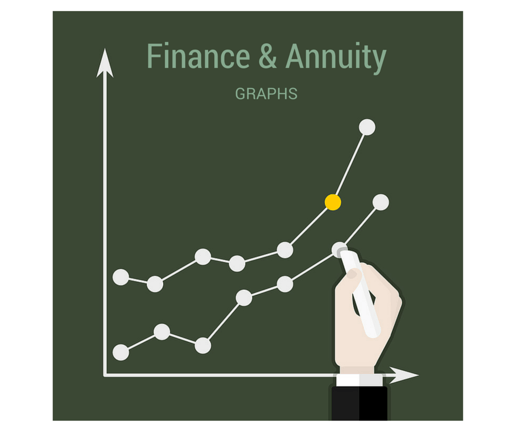
Understanding Finance & Annuity Graphs
 Written by Eddy Hood
You must be able to identify financial trends in order to be a successful investor. There are numerous investment options available for people wishing to build a financial portfolio. Deciding on the right investments is critical to any financial planning, as building a balanced portfolio helps limit losses. A balanced portfolio includes high-risk and low-risk investments, and is comprised of tools such as stocks, bonds, futures, options, mutual funds, CDs and annuities. When determining which investment tools are best for them, investors analyze financial trends using a variety of finance and annuity graphs.
Column
The column chart is one of the most familiar charts to people and is used for many purposes, including tracking the highs and lows of financial products. A column chart tracks the progress of something over a set period of time. When used for financial products, a column chart usually has a percentile vertically on the left-hand side - which is called the Y axis - to track the gains and losses of the product over a set period of time outlined along the bottom or the X axis. Imagine you are analyzing a stock to add to your portfolio. Along the Y axis are percentages from 10 to 100; along the X axis are the months January through December. Rises in percentages throughout the year are gains the stock realized in the stock market; when the monthly columns lower to smaller percentages, the stock has lost value in the market.
- Microsoft Office: Available Chart Types
- Grade A Math Help: The X-axis and Y-axis Remembered!
- NASDAQ: Stock Charts
Line
Line charts are also set up much like a column chart. They have a Y axis and X axis, and each point along the X axis is connected by a line, showing upward and downward trends of the financial product in a "connect the dots" pattern. Line charts for annuities might also have information running vertically down the right-hand side of the chart to track an anticipated financial result over time, for example. If you were comparing annuity products, you might be presented with a line chart that shows the difference in growth between a fixed or variable rate annuity over time, and how this growth is impacted by inflation. These numbers would be represented by lines on a line chart, with each line representing each annuity's information.
- Line Graphs
- StockCharts.com: Chart Analysis
- Independent Stock Investing: Line Chart
- Scottrade: Basic Charts
Pie
A pie chart is another very common chart that most people recognize. A pie chart is a circle, with pieces of the pie separated by colors to demonstrate a comparison of items in question. For example, assume you are comparing the annual returns of different financial vehicles. In this case, you are comparing the annual returns of stocks, bonds, futures, CDs and annuities; the higher percentage of investment return each vehicle has, the larger piece of the pie. In this case, the pie chart would have five separate pieces representing each investment vehicle; each piece of the pie would have a different color. The pie chart would present a quick snapshot of the return percentage of each investment overall. If the pie chart showed the returns of each investment over a one-year period, you will see how each investment performed over that year from highest to lowest based on the size of each pie piece. Pie charts are also commonly used for budgeting.
- Pie Charts
- Math Warehouse: Make a Pie Chart
- Seton Hall University: Creating Pie Charts
- Middle Tennessee State University: Making a Pie Chart in Excel
Area
Area charts look like mountain ranges. They map information over the Y and X axis by connecting the dots over time much like a line chart and then filling in the area from the line down to the X axis in color like the pie chart. This makes reading the chart easier on the eyes for investors who want to track and compare investments over an extended period of time. The major stock exchanges and indexes, such as the New York Stock Exchange, NASDAQ, the Dow Jones Industrial Average and the S&P 500, use area charts to demonstrate gains and losses over daily, weekly, monthly and annual periods. This gives investors a quick snapshot of how the overall markets and indexes are doing. For example, if you wanted to see if the NYSE overall closed at the end of the day up or down from its opening number, you might view the day's charted activity on an area chart; the chart would show by hour how all the investments on the NYSE performed throughout the day in one lump sum.
Scatter
Scatter charts are named so because the information plotted on the chart are dots "scattered" across horizontal lines on the Y axis. For example, scatter charts are used to determine linear correlation between different financial vehicles so investors can see if the investments are moving closely together or in opposite directions in the market. Linear correlation - also called financial correlation - is often used to help investors balance their portfolios. For example, assume you used a scatter chart to see the differences in movement between stocks and bonds. In analyzing the scattered dots, you see that stocks are moving upward and bonds are moving downward in the markets. This linear correlation demonstrates that a combination of stocks and bonds might help balance a portfolio by including both upward and downward moving investments - losses are balanced out by gains.
- Scatter Plots
- Online Bookkeeping Services
- Creating a Scatter Plot in Excel
- AI Stock Charts: Linear Correlation Explained


.svg "Rewind Logo-vector-dark (2)")

